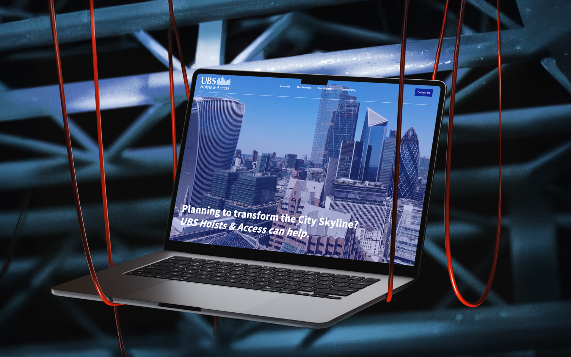
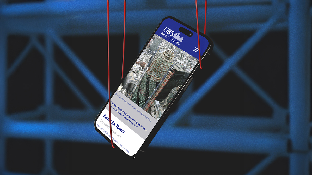
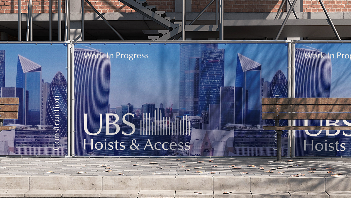
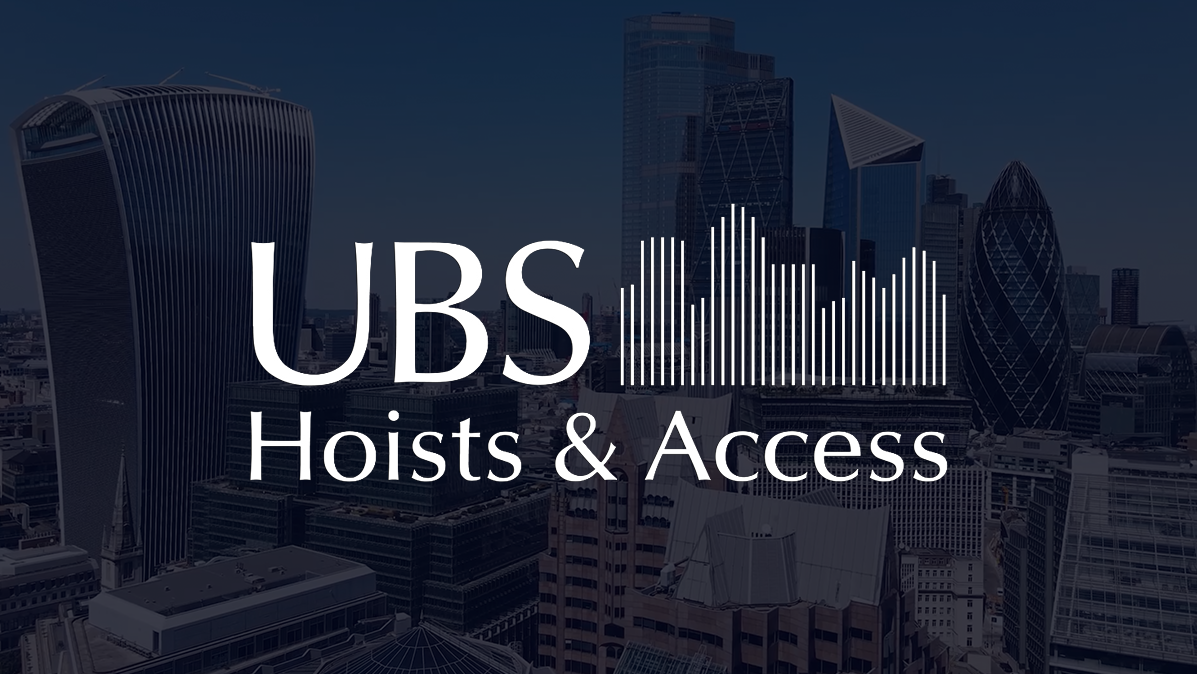
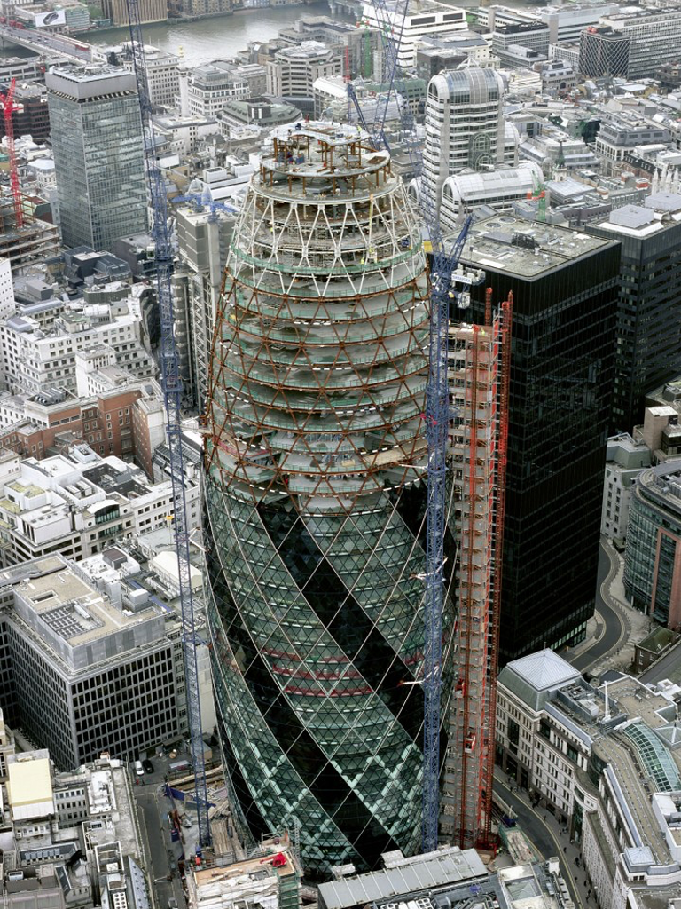
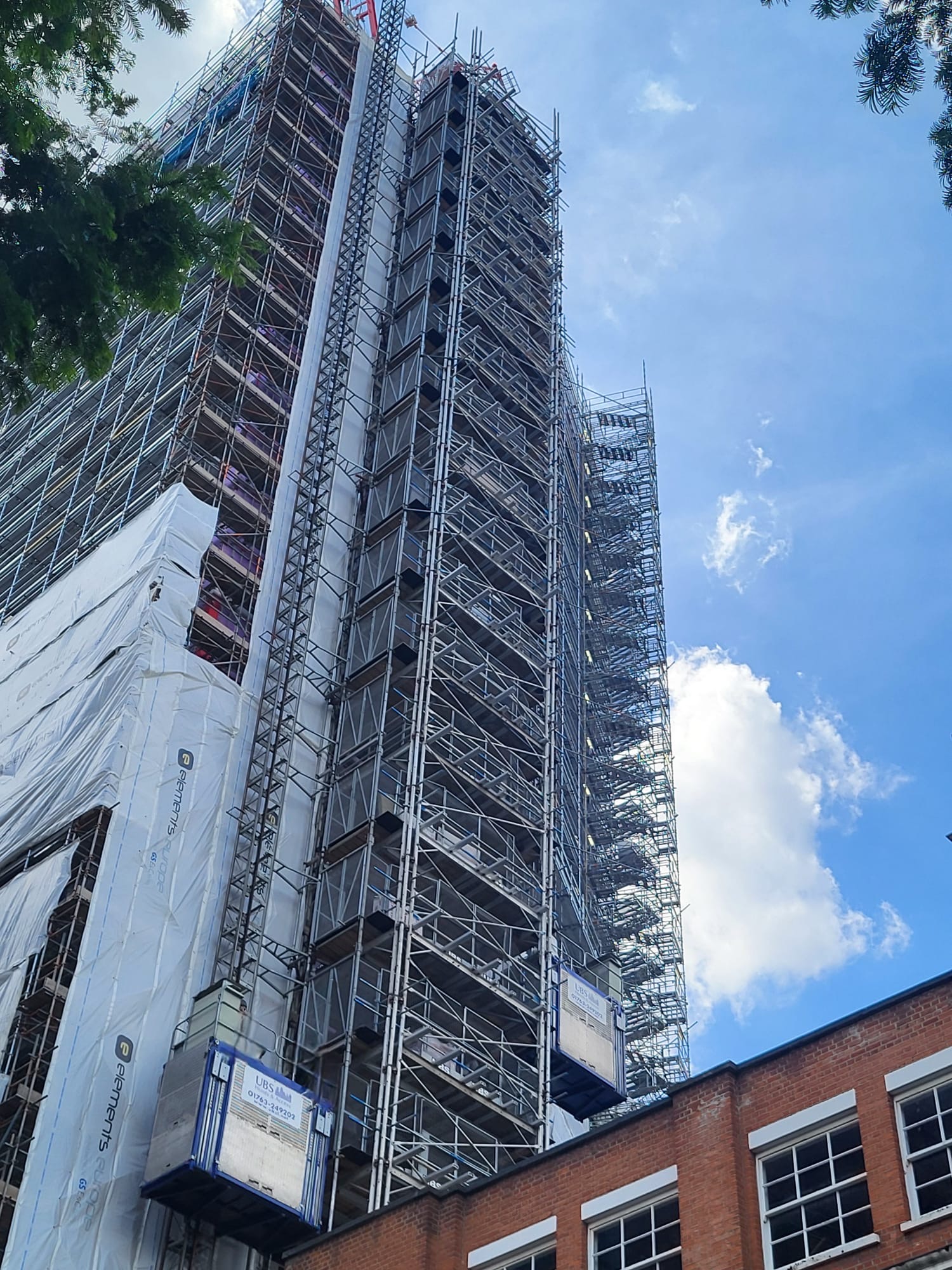
At The House of Holloway, we specialise in transforming digital presences to match industry-leading reputations. UBS Hoist & Access, the UK's leading hoist and access company, needed a website that truly reflected their status. Having worked on some of the country’s most iconic buildings, such as The Gherkin and Heron Tower, they required a platform that showcased their expertise while also addressing a major issue: their U.S. counterpart was ranking above them on Google for their own business name.


Our Key Deliverables
- Reclaiming Digital Authority: By retaining their original domain name and meticulously relinking every original link, we preserved their website’s power and search authority while modernising the structure.
- Industry-Leading Design: The website was built to position UBS as the leader they are, reflecting their scale, experience, and expertise in hoist and access solutions.
- SEO Strategy & Competitive Ranking: With UBS in the U.S. outranking them on Google, a key goal was to reclaim the top spot in search results. We implemented a tailored SEO strategy to boost visibility and ensure UBS UK’s dominance in online searches. In recent years, UBS has noticed a shift - business is no longer conducted solely on the construction site. A strong digital presence is now essential for securing contracts, building trust, and showcasing expertise. Their new website is designed to position them at the forefront of the industry, both on and offline.
- Seamless User Journey: A modern, responsive design that ensures effortless navigation on all devices.
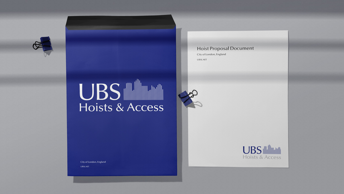
- Content Overhaul & Brand Positioning: From service pages to case studies, we crafted compelling content that showcases UBS's expertise and reinforces their status as the UK’s leading hoist and access provider.
This website has only been live for a few weeks, but one thing to note we are already above UBS in the US on Google.
Why They Chose Us
Custom-built website
Fully SEO optimised
Full brand identity + design system
Ongoing support
Hover over link five
Logo
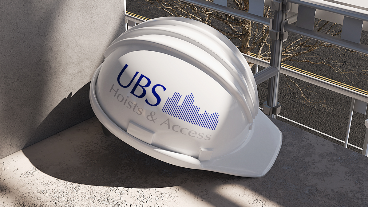
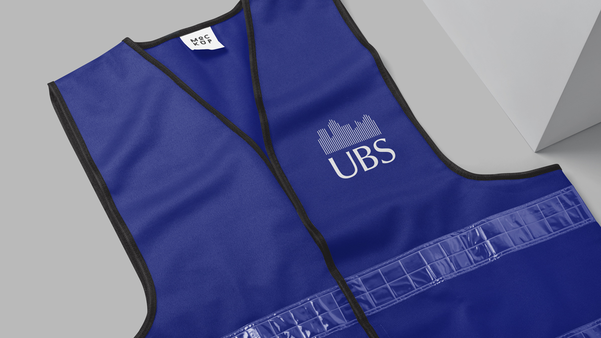
The client's logo uses strong diagonal lines throughout, balancing weight with stability.
Logo Applications
Built for bold visibility across every surface, the Everyday Roofing logo was designed to hold its own on everything from vans to hoardings.
We prioritised clarity, ensuring visitors could quickly find the information they needed without unnecessary complexity.
Typography
No-nonsense typography with weight and clarity. Chosen to communicate confidence at every scale, from business cards to billboards.
Colours
Brick orange and slate grey nod to the materials and environment of the construction industry. The palette is bold, functional and built to carry across every surface with impact.

The House Of
Holloway

Company Number - 15379432,
VAT Number - 486532853