The client came to us with a Squarespace website that looked fine but underperformed in SEO and needed stronger, more cohesive copy. Their goal was a full rebuild that would improve search visibility and present their brand messaging clearly. We focused on creating a site that combined design, structure, and compelling copy to engage visitors and support SEO.


Our Key Deliverables
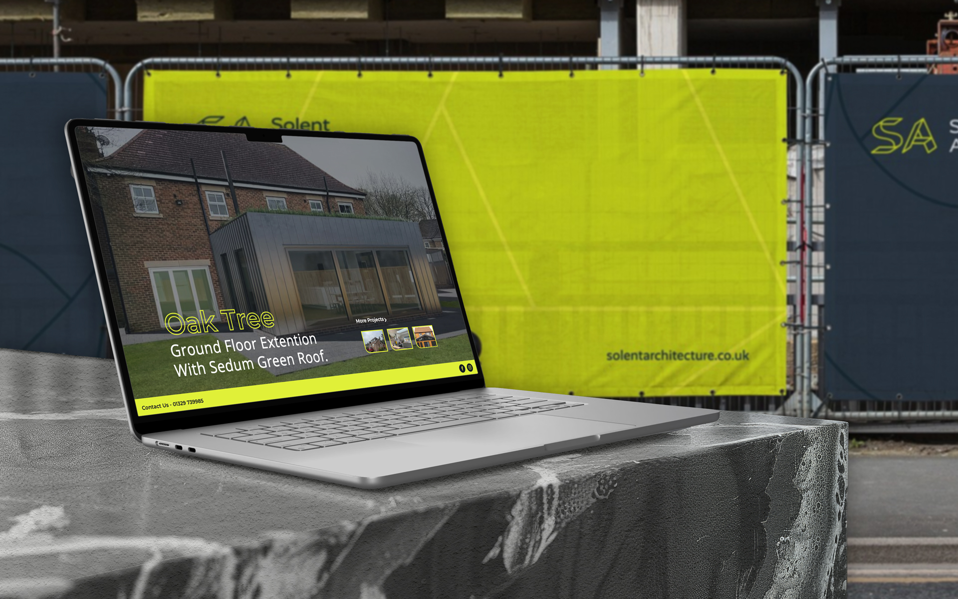
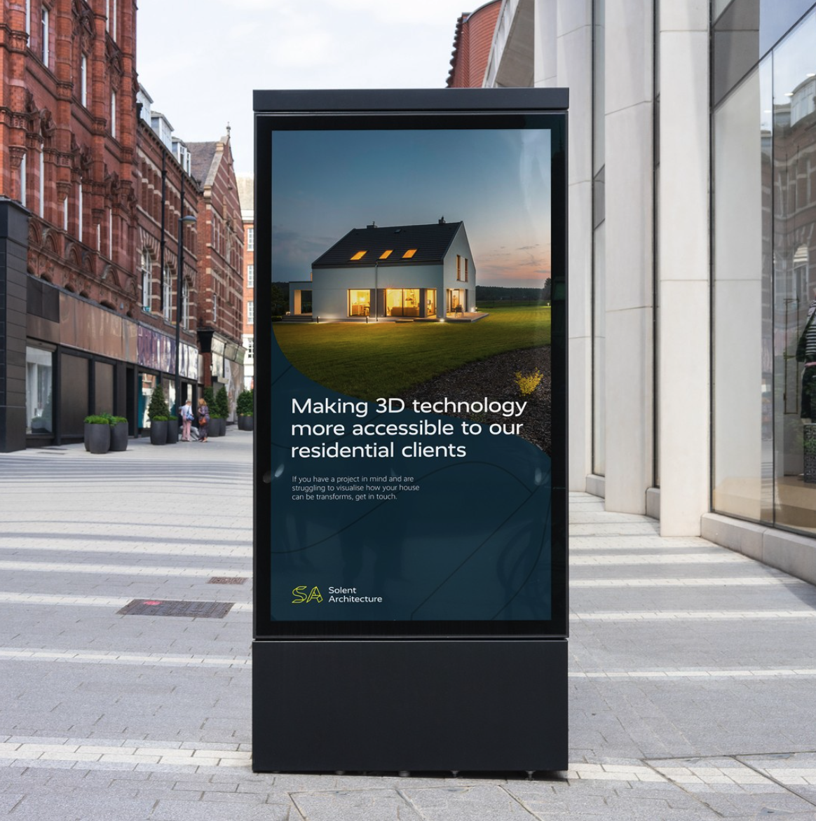
- Website Design and Build: We built the site on WordPress, a platform optimised for SEO. The redesign focused on a clear, professional layout, improved navigation, and user experience enhancements that made the site both visually appealing and search-friendly.
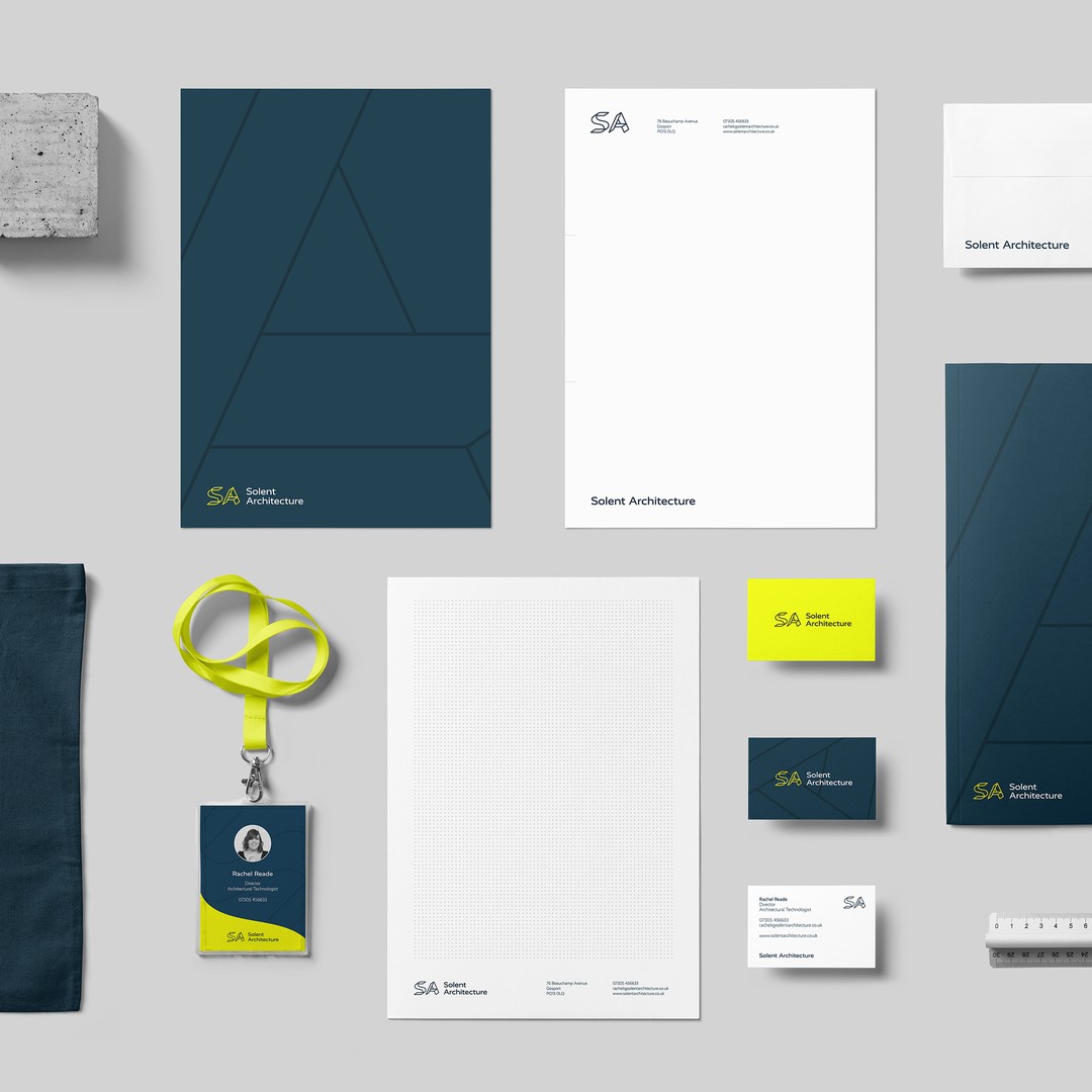
- Copywriting: We wrote the majority of the site copy, crafting content that aligned with the client’s brand voice and improved clarity across all pages. This included SEO-optimised text designed to engage visitors and support higher search rankings, ensuring the messaging was as effective as the design.
- SEO and Content Strategy: The site was planned with search performance in mind from the beginning. We structured content to support relevant service and location-based keywords, giving the business a stronger foothold in organic search.
Despite the website being live for less than a week, we are already seeing excellent results! These include": Ranking no.1 for the search term "affordable architect in Portsmouth" and 10+ other search terms on page 1 of Google already.
Why They Chose Us
Custom-built website
Fully SEO optimised
Hosting & Site Management
Ongoing support
Hover over link five
Logo
The client's logo uses strong diagonal lines throughout, balancing weight with stability. The Branding was completed by Studio Wallis.
Logo Applications
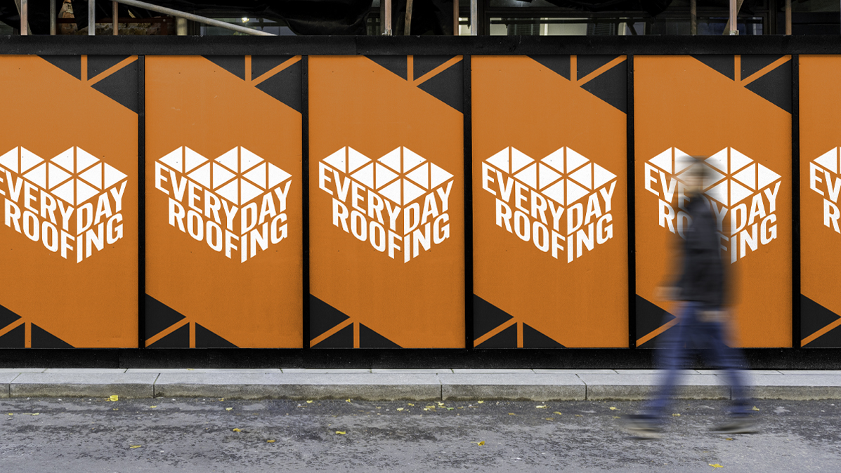
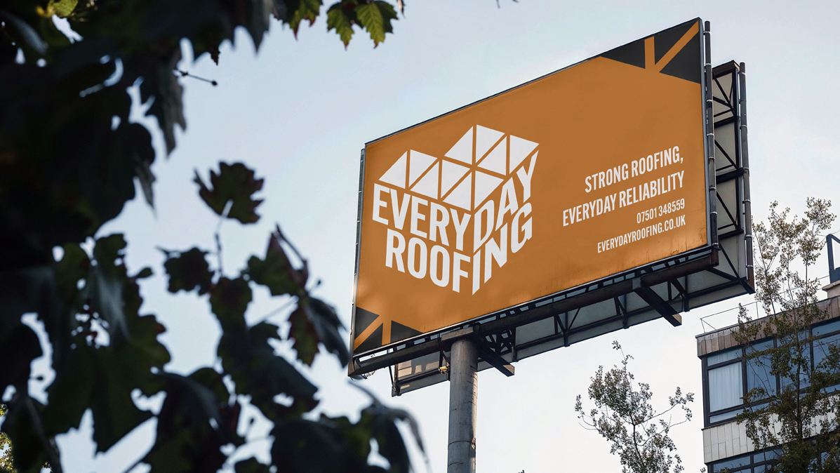
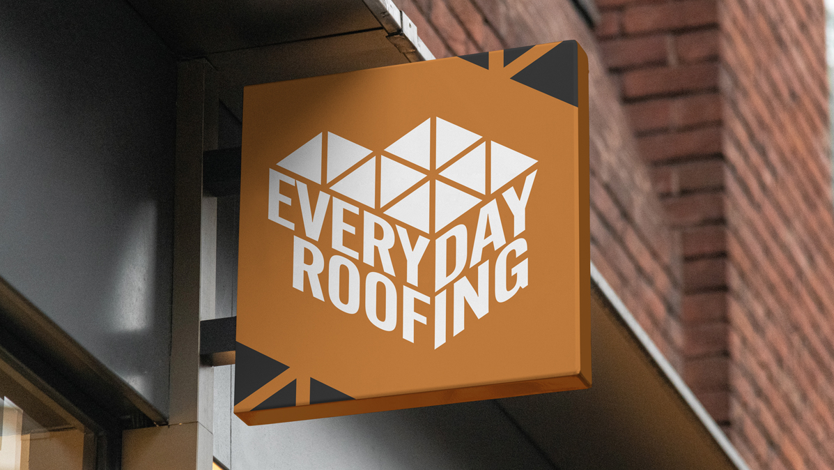
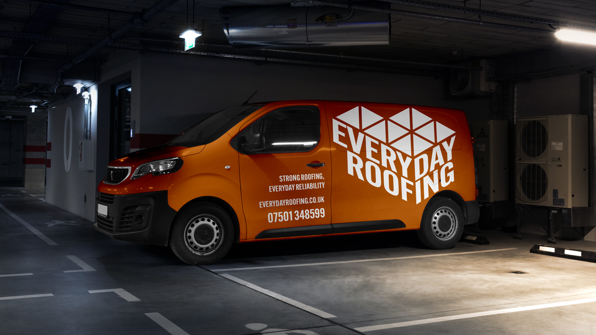
Built for bold visibility across every surface, the Everyday Roofing logo was designed to hold its own on everything from vans to hoardings.
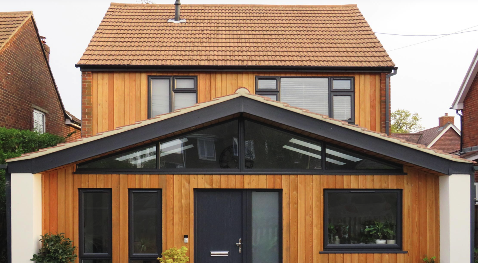
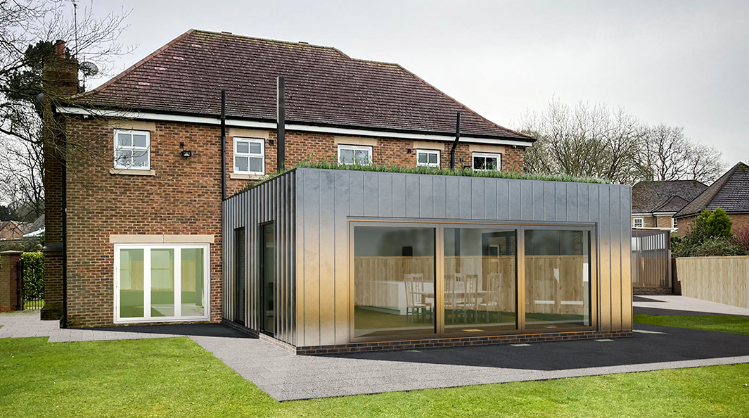
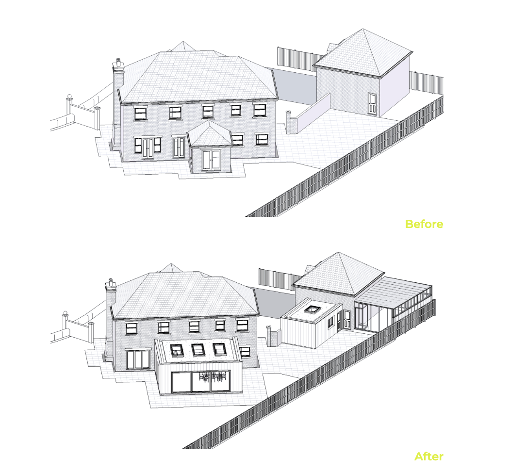
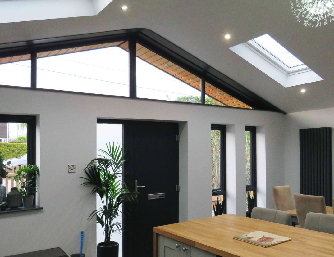
Crafting a strategic inpactful conversion-driven website allowing the work to speak for itself. Creating a digital presence that not only reflects their professionalism, but is delivering exceptional search performance.
Typography
No-nonsense typography with weight and clarity. Chosen to communicate confidence at every scale, from business cards to billboards.
Colours
Brick orange and slate grey nod to the materials and environment of the construction industry. The palette is bold, functional and built to carry across every surface with impact.
The House Of
Holloway

Company Number - 15379432,
VAT Number - 486532853