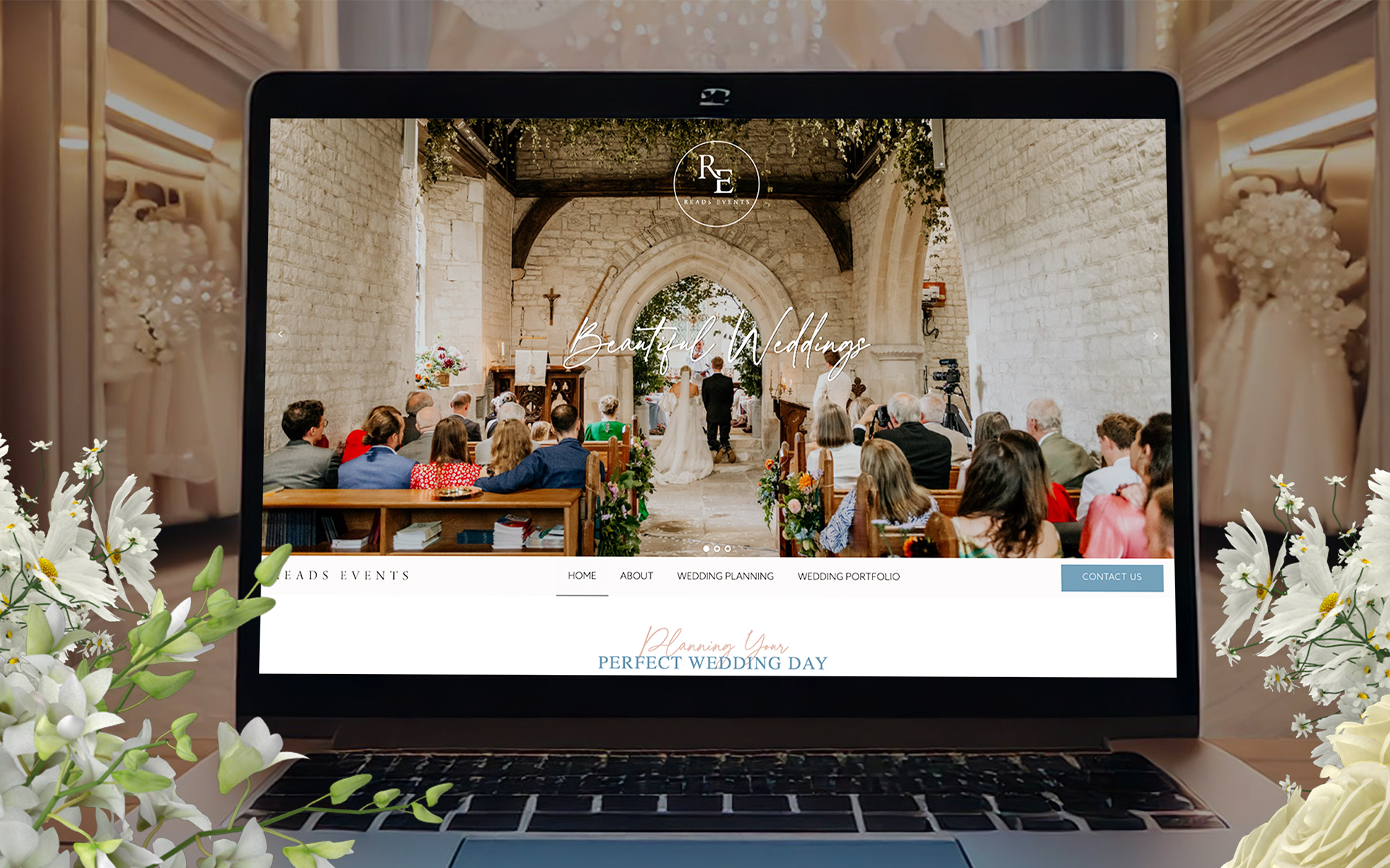
Reads Events is a start-up wedding planning service with a vision to create a unique and personalised experience for couples. The couple had a logo but lacked a cohesive brand identity. One of the key challenges was bringing their brand to life in terms of colours, imagery, and fonts in a way that would reflect the premium, bespoke nature of their services, while keeping budget considerations in mind. With a custom-built website designed specifically for start-ups, our goal was to help them stand out in a competitive market, attract potential clients, and ensure their brand communicated quality, trust, and attention to detail.


Our Key Deliverables
- Redesigned website with improved user interface and experience.
- SEO optimisation strategies for enhanced organic visibility.
- Mobile-optimised website design.
- Streamlined communication and response processes.
Number one for searching terms such as 'South Coast Loft Conversions' on Google.
When you're at the top, you save a huge sum of money not having to pay for Googles Ads that can be as expensive at £6 per click depending on how competitive the keywords are.
Why They Chose Us
Custom-built website
Fully SEO optimised
Hosting & management
Ongoing support
Hover over link five
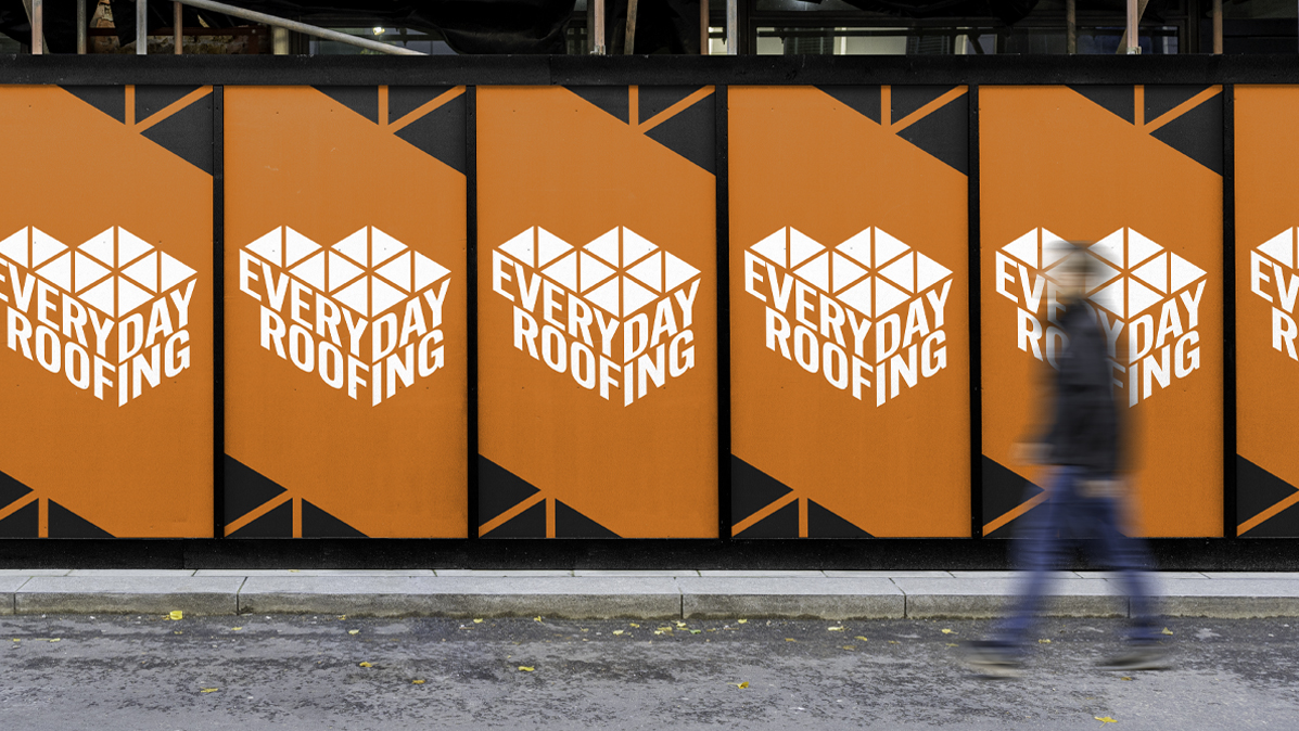
Logo
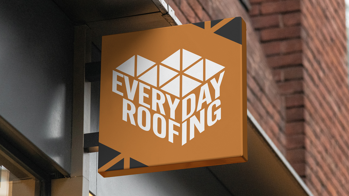
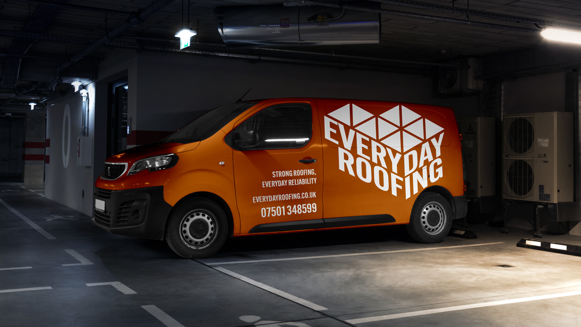
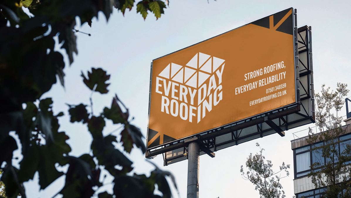
The client's logo uses strong diagonal lines throughout, balancing weight with stability.
Logo Applications
Built for bold visibility across every surface, the Everyday Roofing logo was designed to hold its own on everything from vans to hoardings.
From the meticulous design of their award-winning website to the strategic deployment of SEO techniques, our collaboration has positioned BMC as a prominent player in the competitive loft conversion industry.
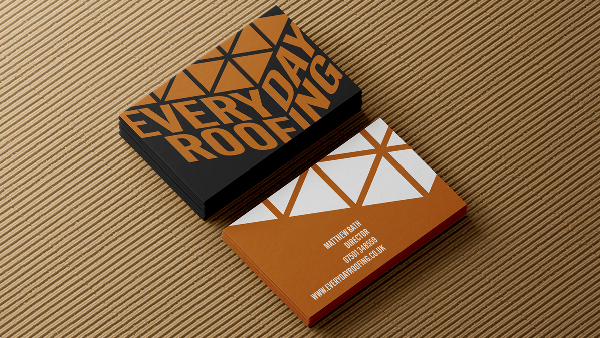
Typography
No-nonsense typography with weight and clarity. Chosen to communicate confidence at every scale, from business cards to billboards.
Colours
Brick orange and slate grey nod to the materials and environment of the construction industry. The palette is bold, functional and built to carry across every surface with impact.
The House Of
Holloway

Company Number - 15379432,
VAT Number - 486532853