Clear Property Management
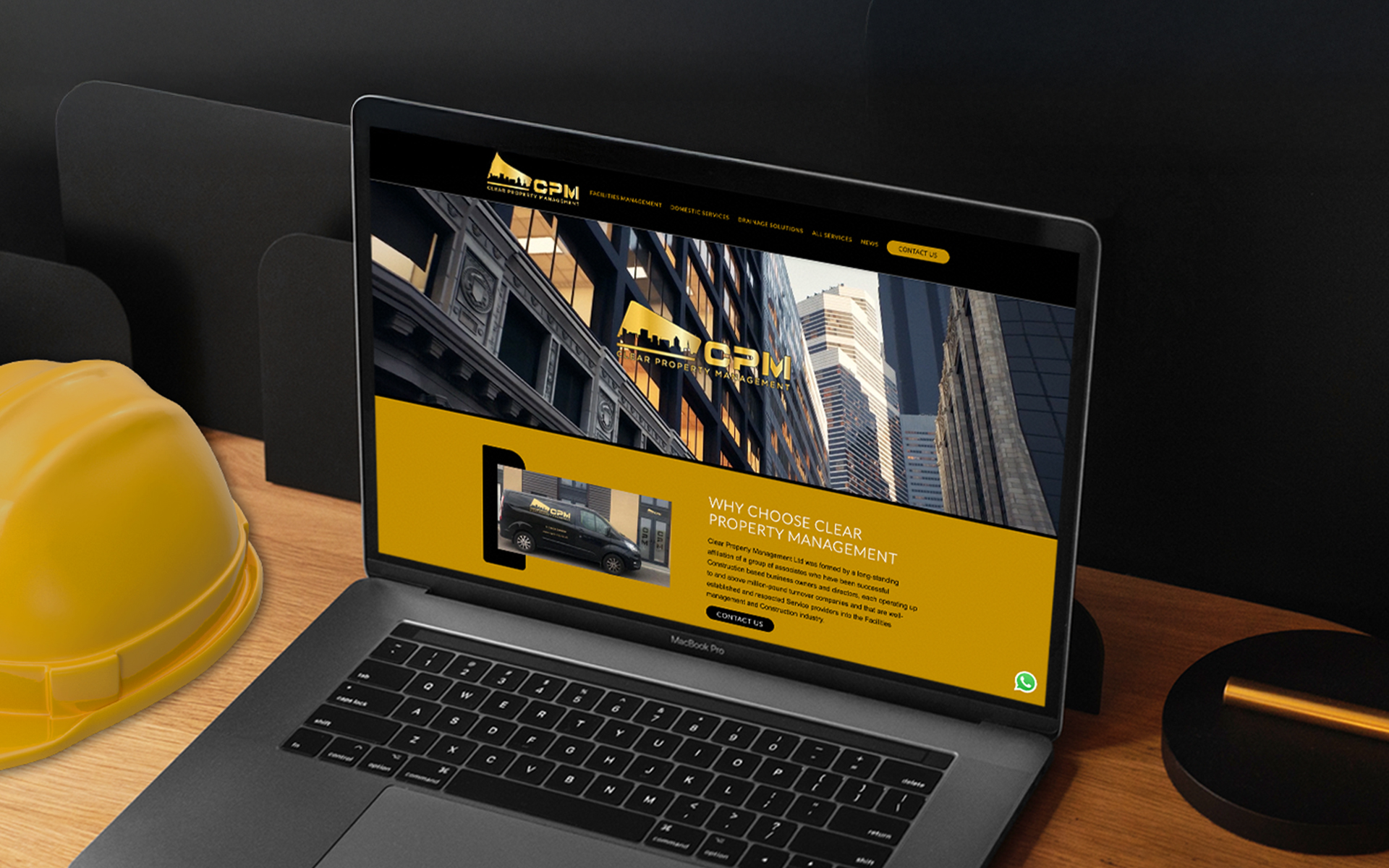
Clear Property Management is a forward-thinking Facilities Management company operating across London and the South East. Their outdated Wix website no longer reflected the calibre of their work or the scale of their operations. With ambitions to attract contracts from large commercial office buildings and high-profile property managers, they needed a complete redesign—visually, structurally, and strategically. The House of Holloway was brought in to expand their brand and create a professional online presence that aligned with their growth ambitions.
Social Media / Email Marketing


Our Key Deliverables
– A custom-designed WordPress website with strong commercial appeal.
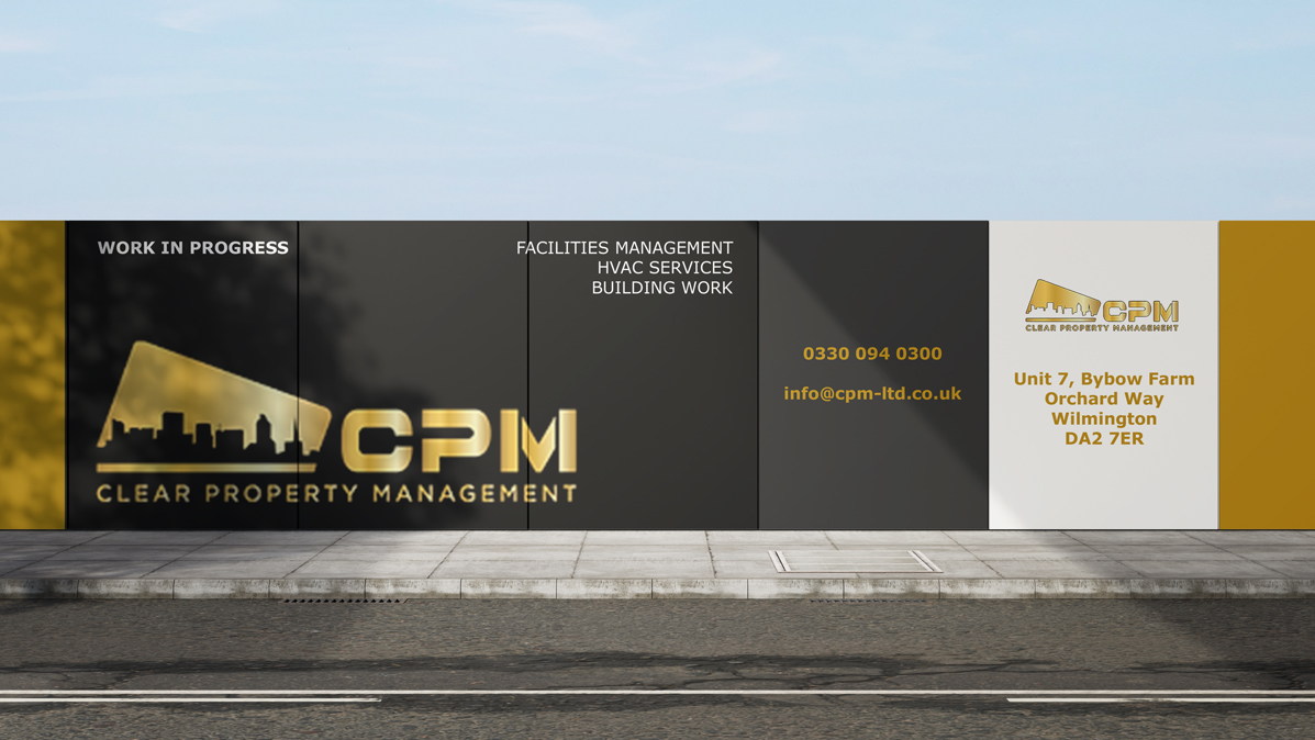
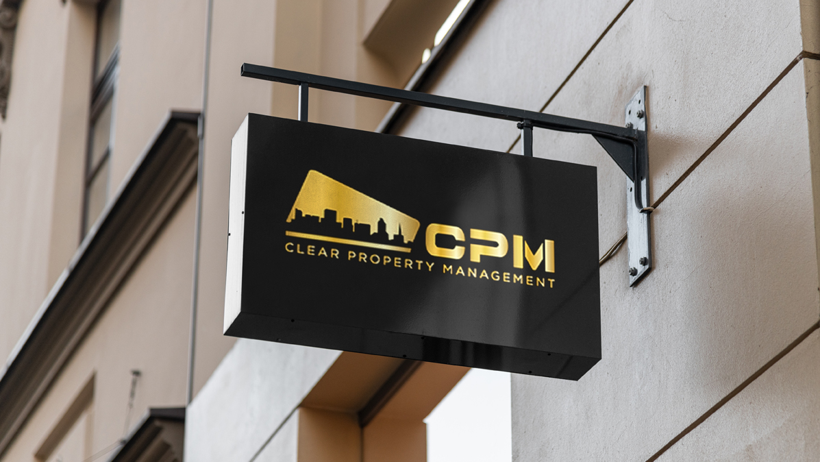
– A refreshed visual identity adapted across the site– SEO-ready copy tailored to facilities management and property services- Keyword research, leading to keyword specific pages.
– Integrated links to social platforms including LinkedIn, Instagram, and TikTok- Localised SEO using duplicate homepages for cities and boroughs in & around London.
- Using the overhauled brand to create outreach email marketing campaigns- Managing Clear Property Management social media presence.
We built a strong keyword strategy around the services and locations that matter most, including:
Facilities management
London-Commercial property maintenance
Planned and reactive building services
Office maintenance teams
By creating content-rich service pages and optimising for key search terms, we’ve put Clear Property Management on the map for major clients looking to outsource their FM needs.
Why They Chose Us
Custom-built website
Fully SEO optimised
Hosting and site management
Ongoing support
Hover over link five
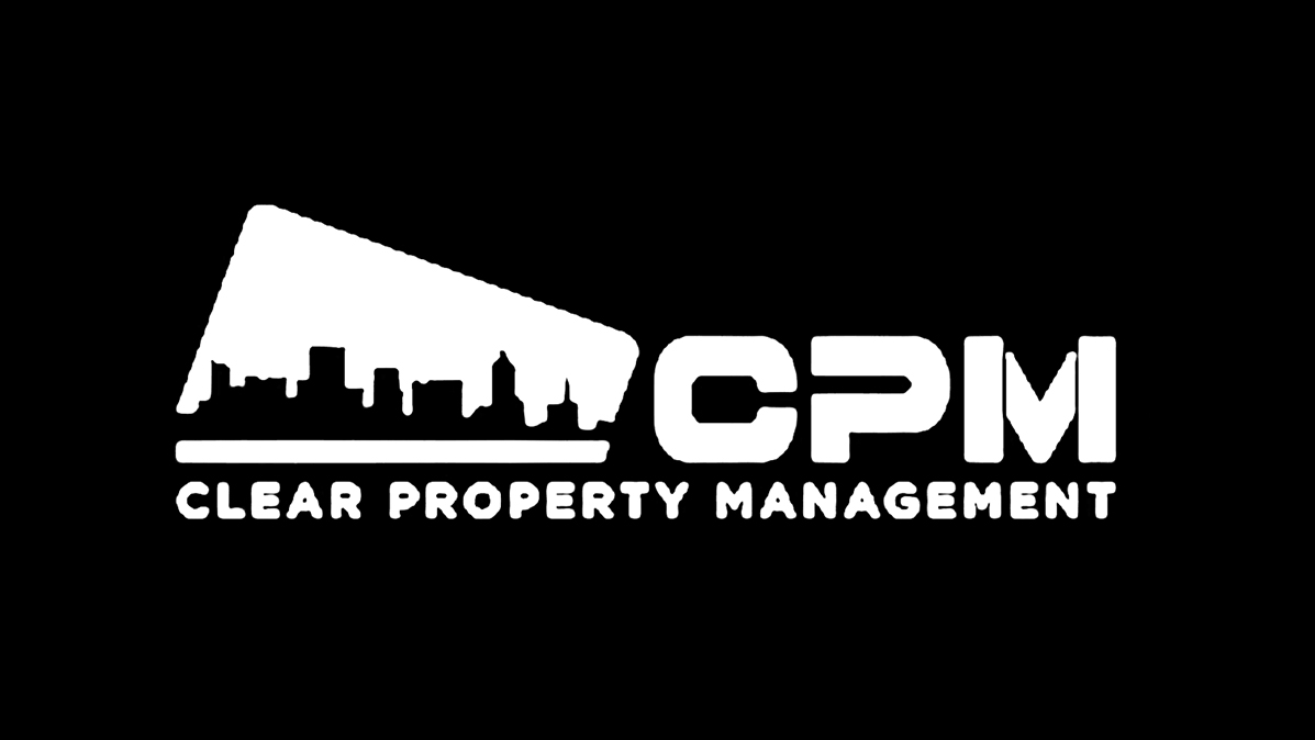
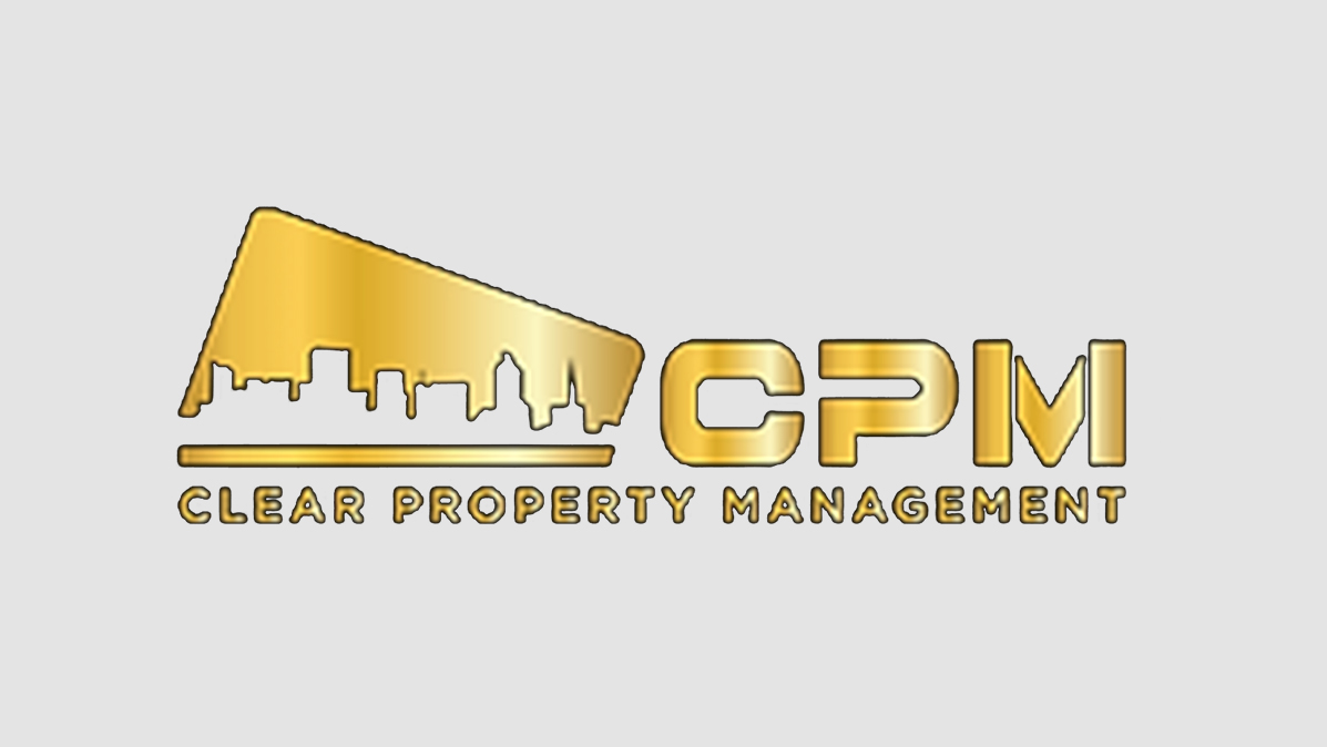
Logo
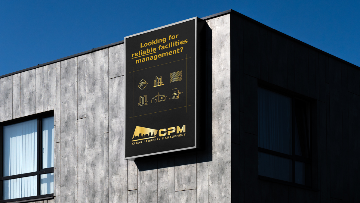
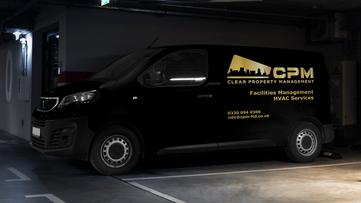
The client's logo uses strong diagonal lines throughout, balancing weight with stability.
Logo Applications
Built for bold visibility across every surface, the Everyday Roofing logo was designed to hold its own on everything from vans to hoardings.
From transforming their outdated Wix website into a polished, SEO-focused commercial platform to strengthening their brand across digital marketing, positiong them to compete for larger commercial contracts.
Typography
No-nonsense typography with weight and clarity. Chosen to communicate confidence at every scale, from business cards to billboards.
Colours
Brick orange and slate grey nod to the materials and environment of the construction industry. The palette is bold, functional and built to carry across every surface with impact.
The House Of
Holloway

Company Number - 15379432,
VAT Number - 486532853